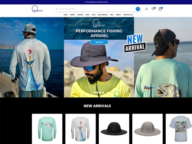
Mobile-First Design
Layouts designed for the phone screen first, then adapted for tablets and desktops, so nothing important gets squeezed out.
Get A QuoteMobile-first websites that look sharp and work properly on every phone, tablet and desktop your customers use.
Designed for the Phone First
Most of your visitors in the UAE arrive on a phone. If the site is hard to read, slow or awkward to tap, they leave. We design the mobile screen first, then scale up — tested on real devices, so every visitor gets a site that is easy to use.
Start Your ProjectNew mobile-first websites, and fixes for existing sites that do not work properly on smaller screens.
Layouts designed for the phone screen first, then adapted for tablets and desktops, so nothing important gets squeezed out.
Get A QuoteOlder sites that break on mobile rebuilt with a flexible layout that adapts to any screen.
Get A QuoteImages, code and hosting tuned for mobile connections, so pages load quickly away from office Wi-Fi.
Get A QuoteEvery page checked on real iOS and Android phones, tablets and desktop browsers before launch.
Get A QuoteRight-to-left Arabic pages that adapt as cleanly as the English ones on every screen size.
Get A QuoteReadable contrast, clear focus states and properly sized tap targets, so more people can use the site comfortably.
Get A QuoteResponsive websites we have designed for businesses across Dubai and the UAE.
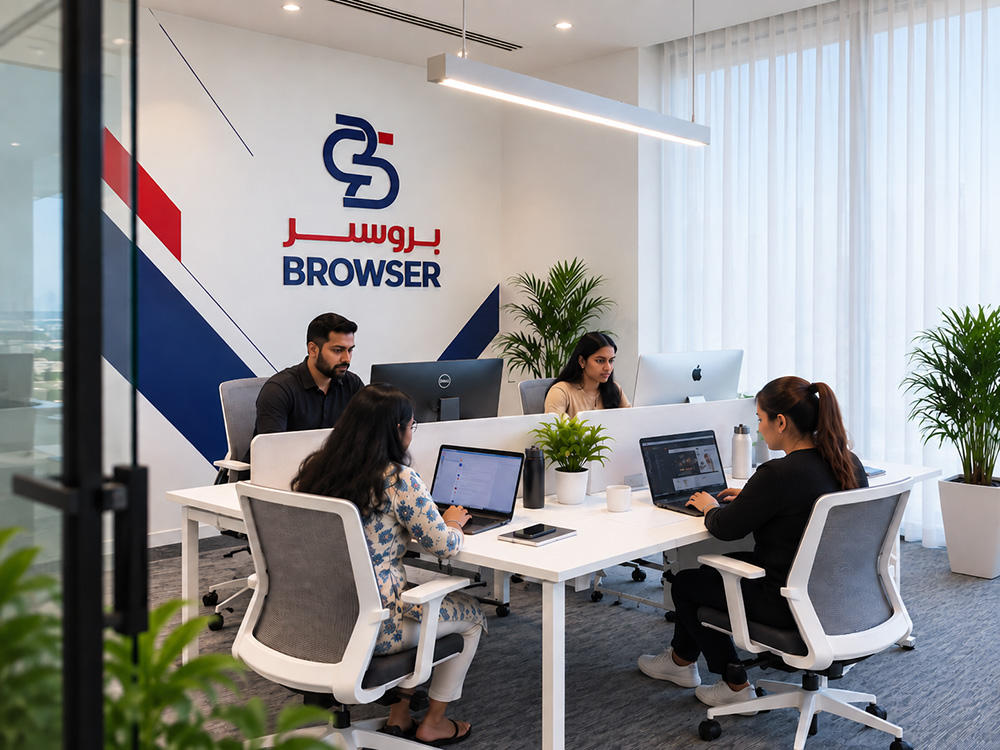
Google ranks the mobile version of your site, and your customers judge you on it. So that is the version we design first.
Starting with the phone forces clear priorities — what matters appears first on every screen.
We check pages on real phones and tablets, not just a resized browser window.
Most responsive business websites go live within three to five weeks.
Pages are built light, so they load quickly on mobile connections across the Emirates.
Google uses the mobile version of your website to decide how it ranks. A site that is slow or broken on phones is held back in search, however good it looks on a desktop.
A great mobile experience is now a ranking requirement, not a nice extra.
Many sites technically resize but are still hard to use — tiny text, buttons too close together, menus that hide what people need. We review your site on real devices and tell you honestly whether it needs fixes or a rebuild.
Resizing is not the same as working well on mobile.
At BROWSER we follow a fully streamlined process, so you always know which stage your website is at and what happens next.
We work out what the site actually has to do — the pages, the integrations, the people who will edit it — and write it down. Most build problems start as scope that was assumed rather than agreed.
Sitemap, page outlines and content model agreed before any design, so every page has a job and nothing important is left to the end.
Layouts designed mobile-first and reviewed with you as real pages, not isolated screenshots, with every state accounted for.
The site built on a staging server with regular previews, so you see working pages as they land rather than a silent gap followed by a reveal.
Functionality, cross-browser, responsive, speed and security testing all happen on staging. Nothing goes live untested.
We launch to a pre-launch checklist, watch the first days closely, then hand over access and a short walkthrough. Twelve months of support starts here.
Fourteen years of work across the UAE means we rarely start from a blank page. We already know how your customers search, what they compare and what makes them pick up the phone.
What clients ask about mobile-friendly websites.
It is a way of building a website so the layout adapts to the screen it is viewed on — phone, tablet or desktop — instead of having separate sites for each.
Often, yes. Sometimes targeted fixes are enough; for older builds a rebuild is quicker and cheaper in the long run. We review the site first and recommend the better option.
Most business websites take three to five weeks from kick-off to launch, depending on the number of pages and how quickly content is ready.
Yes. Google ranks the mobile version of your site, and speed and usability on mobile are part of how it measures page experience.
Yes. We test on real iOS and Android phones and tablets as well as the main desktop browsers before launch.
Yes. Every website includes 12 months of free support after launch.
Please fill in the form below and our team will get back to you shortly.