
UX Research
Interviews and analytics that tell you what people actually do rather than what they say they do. The cheapest phase, and the one most often skipped.
Get A QuoteResearch, wireframes and interface design for websites, apps and internal tools — decided with evidence rather than opinion.
Designed on Evidence
We research, wireframe and design interfaces for websites, apps and internal tools used across Dubai and the UAE. Every state drawn, every flow tested, and handover files a developer can build from without guessing.
Start Your ProjectFrom a research phase before a build, to fixing an interface already in front of customers — here is what we do for businesses across the UAE.
Interviews and analytics that tell you what people actually do rather than what they say they do. The cheapest phase, and the one most often skipped.
Get A QuoteStructure resolved in grey boxes before anything is styled, so arguments about layout happen while they are still cheap and nobody defends a colour instead.
Get A QuoteThe visual layer built on a resolved structure — type scale, spacing, states and components, drawn to be built rather than to win an award for a mockup.
Get A QuoteA component library with tokens, states and rules, so the tenth screen is designed in an hour and still matches the first. Essential once more than one person is building.
Get A QuoteA clickable prototype put in front of real people before anything is built. Ten sessions will find the problems that would otherwise surface as support tickets.
Get A QuoteiOS and Android interfaces designed to their own conventions rather than one layout stretched across both, with every state drawn — loading, empty, error and offline.
Get A Quote
A redesign that starts with a mood board is a guess. We start with what your data and your users already know, then design against it.
Analytics and a handful of interviews usually make the answer obvious within a week — and turn a design debate into a decision nobody has to win on taste.
We resolve structure in wireframes before anything is styled. It keeps the conversation on whether the flow works, rather than on a colour that has not been chosen yet.
Loading, empty, error, too-long-name, no-results and offline. Interfaces fail in the states nobody designed, and developers should not have to invent them.
Real type scales, real spacing values and components a developer can implement without guessing. We build too, so we know exactly what a handover is missing.
Interfaces and journeys we have designed for businesses across Dubai and the UAE.
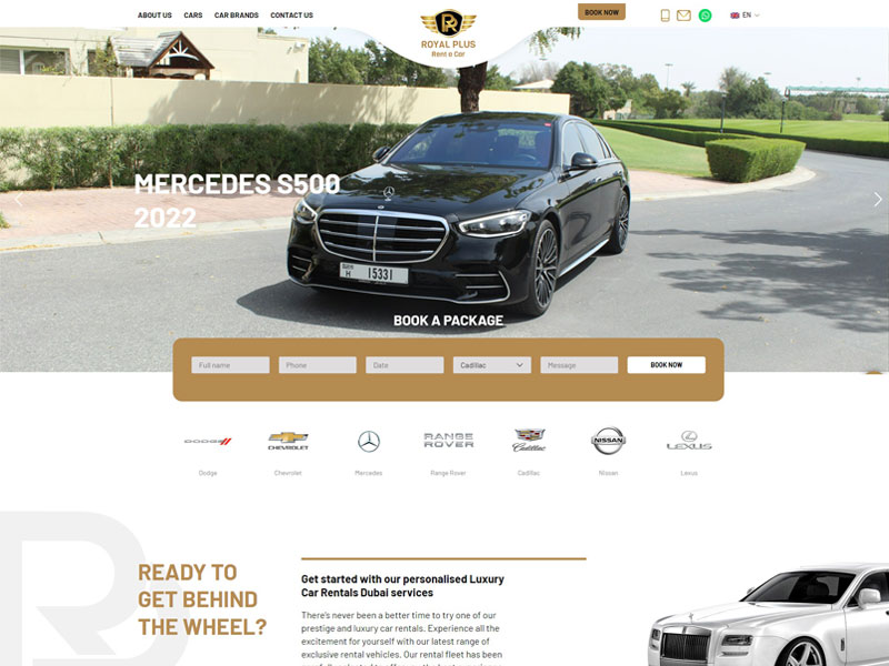 Booking Flow
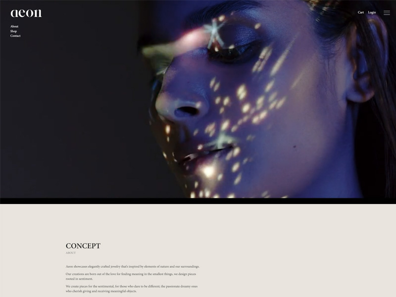 Checkout UX
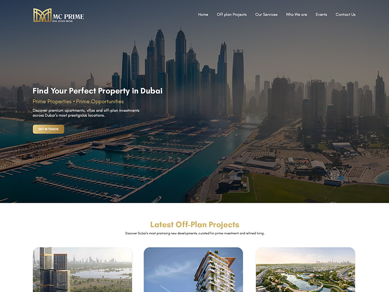 Search & Filters
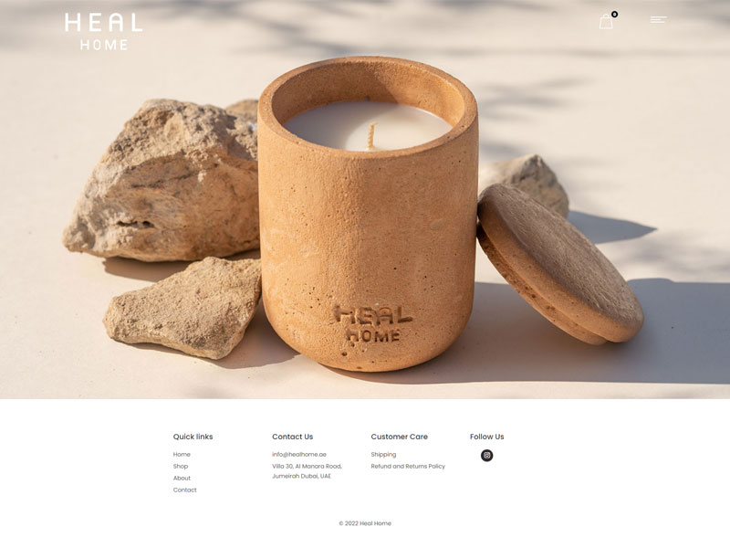 Appointments
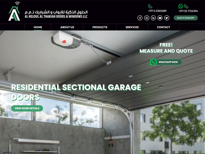 Arabic & English
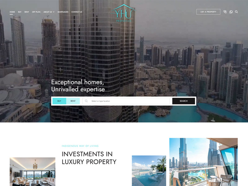 Product Site
Almost every expensive redesign started as a guess. Finding the real problem is faster and cheaper than redesigning around a suspected one.
We would rather spend a week proving what is wrong than a month redesigning what was not.
A mockup is not a specification. Most build problems come from a design that only ever showed the perfect case at one screen width.
We build as well as design, so the handover contains what we would want to receive.
At BROWSER we follow a fully streamlined process, so you always know which stage the design is at and what happens next.
Analytics, interviews and a look at your competitors. We come back with what is actually happening, ranked by what it is costing you.
Sitemap, user flows and the content model agreed before any screens exist — including the awkward paths, not just the one where everything goes right.
Layout and hierarchy resolved in grey, reviewed with you, and changed freely — because this is the last stage where changing your mind is close to free.
Type, colour, spacing and components applied to the resolved structure, with every state drawn and the whole thing built on a system rather than page by page.
A clickable version put in front of real users. Five to eight sessions consistently find the problems that would otherwise arrive as support tickets after launch.
Annotated screens, a component library, tokens and specs — and we stay reachable while it is built, because questions always come up.
Fourteen years of work across the UAE means we have usually met your integration, your compliance requirement or your awkward legacy system before.
Research, process, handover and testing — what clients in Dubai ask before a design project starts.
UX is whether someone can do what they came to do — the structure, the flow, the labels, the order of steps. UI is what it looks like once that is decided. Good UI on bad UX produces a beautiful screen people abandon. We do both, but always in that order.
If you have live traffic, it usually pays for itself immediately — the analytics you already have will point at the problem within days. If you are pre-launch, a shorter version focused on competitors and a handful of interviews is enough. What we would not do is skip it and redesign on instinct.
A full website design runs four to eight weeks. An app or a complex product with many states takes longer and is best broken into phases. We scope it properly first so the estimate means something.
Figma files with the full component library and design tokens, annotated screens covering every state, a clickable prototype, and specs a developer can build from. You own all of it, and it is organised so a developer who has never spoken to us can still work from it.
Yes, and often that works well. We stay reachable through the build for the questions a static file cannot answer, and we will review the implementation against the design so nothing quietly drifts. If you would rather we built it too, we do that as well.
Yes, for both iOS and Android, designed to each platform's own conventions rather than one layout stretched across both. That includes the states people forget — loading, empty, offline, error — plus app store screenshots and icons.
With a clickable prototype and real people — typically five to eight, which is enough to surface the significant problems. We give them tasks rather than opinions to offer, because watching someone fail a task tells you far more than asking whether they like it.
Yes, and properly. A right-to-left interface is not a mirrored one — icon direction, number formatting, form alignment and Arabic typography all need deciding rather than flipping. We design both directions and test both.
It is a component library plus the rules for using it. You need one once more than one person designs or builds your product, or once you have enough screens that consistency stops happening by itself. For a five-page brochure site it is overkill; for a product it saves its cost quickly.
It depends on how many screens and states there are, and whether research and testing are included. We scope every project properly first, then quote a fixed price in AED after one short call rather than billing by the hour.
Please fill in the form below and our team will get back to you shortly.